
Calculator JavaScript source code with CSS animation

Here I am sharing a Calculator JavaScript source code with an unusual extra. It simulates a calculator with a printing function. That printing is simulated via a simple CSS animation with transform, coupled with nested structure of HTML elements. This in turn achieves an animated 3D effect of a paper roll coming out of the calculator.
The above calculator is fully functional. Try it now and see how that 3D animation works.
The paper roll is made of a number of lines of text. Every next line is nested within the container of the previous line of text and rotated.
The following illustration has the containers color coded, with the outer most being saturated red, and the inner most pale.
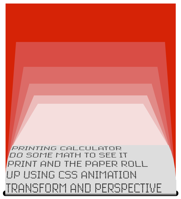
After all, this isn't a real 3D, but something that looks like it. These transformations are not in relation to the viewer's screen, but in relation to their containers. Think of a picture drawn within a picture. So no matter of how many lines are printed, we will never see the roll start going downwards.
Style for containers goes as following:
.container {
  position:    absolute;
  bottom:      0px;
  width:       310px;
  height:      350px;
  perspective: 1600px;
}
.containerNext {
  bottom:    27px;
  transform: rotateX(40deg);
  transform-origin: bottom center;
}
Each container has to be big enough to accommodate all of the child containers. Where
containerNext is an extra style for every container other that the top most. This is the particular style that adds the roll effect. It also sets the pivot point 27px above the bottom of the parent container (above the printed line of text).Animation. Due to the layout nature of "picture in picture", the most recent printed text has to be in the top most container. For that a new container is made to hold the entire stack of existing containers and placed at the root of the hierarchy.
@keyframes emerging-text-block-animation {
    0% { height:  0px }
  100% { height: 27px }
}
@keyframes pushed-container-animation {
    0% { transform: rotateX( 0deg); bottom: 0px }
    4% { transform: rotateX( 5deg); }
   10% { transform: rotateX(10deg); }
   25% { transform: rotateX(20deg); }
  100% { transform: rotateX(40deg); bottom: 27px }
}
Here,
emerging-text-block-animation makes the new line of text appear slowly, while pushed-container-animation is applied to now the second container in the hierarchy, animating it's rotation and shift upwards as the new line of text emerges.Here is the full JavaScript source code for the Calculator: